
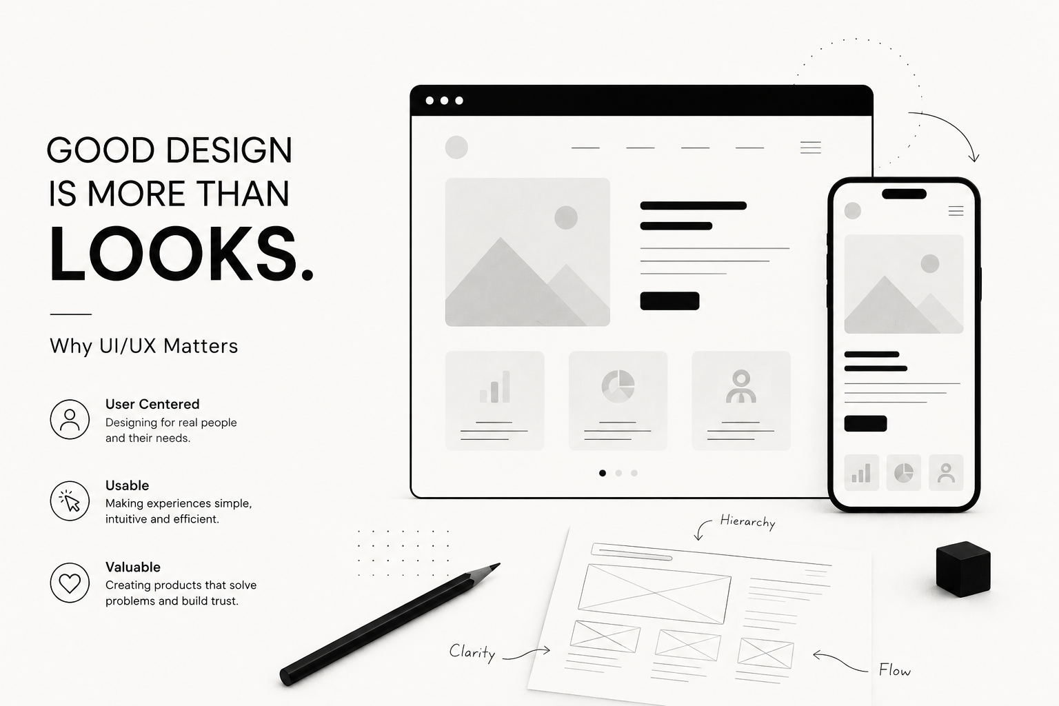
Good Design Is More Than Looks: Why UI/UX Matters
A beautiful interface can attract attention.
A good experience makes people stay.
That difference is at the heart of UI/UX design.
When people hear the word “design,” they often think about colors, typography, imagery, animations, and visual style. Those things matter, but they represent only the visible layer of a much larger experience.
A digital product can look exceptional and still be difficult to use.
A button can be beautifully designed but placed where nobody expects it. A website can have impressive animations while making visitors search for basic information. An application can have a sophisticated dashboard filled with features that users don’t understand.
Good UI/UX solves a different problem.
It asks:
Can people understand this? Can they use it naturally? Can they accomplish what they came here to do?
For me, great design happens when visual quality and usability become almost impossible to separate.
01. UI and UX Are Different, but They Belong Together
UI stands for User Interface.
It covers the visual and interactive elements people see: typography, colors, buttons, cards, icons, forms, navigation, spacing, imagery, and other components.
UX stands for User Experience.
It is concerned with the larger journey: how information is organized, how easily users can complete tasks, whether interactions make sense, and how the product feels throughout the experience.
A simple way I think about it is:
UI is what people interact with. UX is what they experience while interacting with it.
You need both.
Excellent UX with poor visual execution can make a product feel unfinished.
Beautiful UI with poor UX can make a product frustrating.
The strongest digital products balance the two.
02. Design Starts With Understanding People
Before designing an interface, I want to understand who will use it.
Different users have different expectations.
Someone visiting an interior design portfolio may want inspiration and beautiful project imagery.
Someone visiting a construction company’s website may immediately want to understand services, credibility, location, and how to request an estimate.
Someone using business software may need to perform the same task dozens of times every day.
The right interface for one would be completely wrong for another.
That’s why good design doesn’t begin with:
“What should this look like?”
It begins with:
“What does this person need?”
Once that is clear, visual decisions become much more meaningful.
03. Hierarchy Tells People Where to Look
Every interface communicates importance.
A large headline naturally attracts attention before small supporting text. A high-contrast button feels more important than a subtle text link. Whitespace can separate ideas without requiring visible borders.
This is visual hierarchy.
Without hierarchy, everything competes for attention.
Imagine opening a webpage where the headline, navigation, description, buttons, labels, and secondary information all have similar visual weight.
You wouldn’t immediately know where to begin.
Good hierarchy creates a natural reading path.
Headline → Context → Supporting information → Action
The user shouldn’t need to consciously analyze the page.
The design should quietly guide them.
04. Whitespace Is Part of the Design
One of the most powerful design elements is something that technically contains nothing.
Whitespace.
Giving elements room to breathe makes interfaces easier to understand and often makes them feel more premium.
When everything is packed together, users have to work harder to separate information mentally.
Spacing can create those relationships automatically.
Elements placed close together feel connected.
Larger spaces indicate a new section or idea.
Consistent spacing creates rhythm.
This is especially important in minimal design.
When there are fewer decorative elements, spacing becomes one of the primary tools for creating structure.
Whitespace isn’t wasted space.
It is information.
05. Consistency Creates Confidence
Users learn interfaces surprisingly quickly.
If every primary button looks the same, they begin to understand what that visual treatment means.
If headings follow a predictable hierarchy, content becomes easier to scan.
If cards behave consistently, users know what will happen before interacting with them.
Consistency reduces the amount of thinking required.
This applies to almost everything:
Typography.
Spacing.
Buttons.
Colors.
Icons.
Forms.
Hover states.
Animations.
Navigation.
When these elements follow a system, the product feels intentional.
When every page introduces different rules, the experience begins to feel unpredictable.
A good design system isn’t about making everything identical.
It is about establishing enough consistency that users can develop intuition.
06. Good UX Removes Decisions
One of the easiest ways to make an interface difficult is to give users too many choices at once.
Imagine landing on a page with ten equally prominent buttons.
Which one should you click?
Even when all the options are useful, presenting everything with equal importance creates unnecessary cognitive load.
Good UX prioritizes.
What is the primary action?
What information does the user need first?
What can wait until later?
What can remain hidden until it becomes relevant?
The interface should answer those questions before the user has to.
This is why simplicity isn’t necessarily about having fewer features.
It’s about presenting complexity at the right time.
07. Responsive Design Is Also UX Design
A design isn’t finished because it looks good on a desktop monitor.
People interact with digital products across phones, tablets, laptops, large displays, and everything in between.
Each environment changes the experience.
On desktop, there may be enough room for large editorial layouts, multiple columns, and detailed navigation.
On mobile, priorities change.
Navigation may need to collapse. Content may need to reorder. Typography needs different proportions. Buttons need enough space for touch. Large images need intelligent cropping.
Responsive design shouldn’t simply make everything smaller.
It should preserve the intent of the experience.
Sometimes that requires redesigning the composition rather than resizing it.
A great mobile experience should feel like it was designed for mobile from the beginning.
08. Micro-Interactions Make Interfaces Feel Alive
Small interactions can have a surprisingly large effect on how a product feels.
A button subtly responding when hovered.
An arrow moving slightly when a link is selected.
A form field clearly indicating an error.
A menu transitioning smoothly into view.
A successful action showing immediate confirmation.
These moments are called micro-interactions.
They communicate that the interface is responding to the user.
Without feedback, digital experiences can feel uncertain.
Did the button work?
Is something loading?
Was the form submitted?
Did the setting change?
Good interaction design removes that uncertainty.
The user performs an action.
The interface responds.
The user understands what happened.
Simple.
09. Accessibility Is Good Design
A digital product should work for as many people as reasonably possible.
That means thinking beyond aesthetics.
Is the text readable?
Is there enough contrast?
Can someone navigate using a keyboard?
Are buttons large enough to interact with comfortably?
Does information rely entirely on color?
Do images have meaningful alternative text when appropriate?
Accessibility shouldn’t be treated as something added after the design is finished.
Many accessibility principles simply lead to better interfaces for everyone.
Clear hierarchy, readable typography, meaningful labels, predictable navigation, and strong contrast improve usability regardless of who is using the product.
10. Design Should Support Business Goals
UI/UX isn’t only about making users happy.
Good design should also help the product or business accomplish something.
For a portfolio, that might mean encouraging visitors to explore projects.
For a service business, it might mean generating qualified inquiries.
For an e-commerce website, it could mean helping customers discover and purchase products.
For software, it may mean helping employees complete tasks faster.
This is where design becomes strategic.
Suppose a website receives plenty of visitors but very few inquiries.
The immediate assumption might be that it needs more traffic.
But perhaps visitors cannot understand the service.
Perhaps the contact button is difficult to find.
Perhaps the form asks too many questions.
Perhaps there isn’t enough trust-building information before the call to action.
Those are design problems that can directly affect business results.
Good UX connects user needs with business objectives.
11. Beautiful Design Still Matters
With so much focus on usability, it would be easy to conclude that aesthetics aren’t important.
They absolutely are.
People respond emotionally to visual experiences.
Typography can make a brand feel sophisticated or playful.
Color can create energy or calm.
Photography can communicate something that paragraphs of text cannot.
Motion can add personality.
Layout can make a brand feel experimental, luxurious, technical, minimal, or approachable.
Visual design creates perception.
And perception affects trust.
The difference is that aesthetics should support the experience rather than compensate for a weak one.
The goal isn’t choosing between beauty and usability.
The goal is making them work together.
12. Minimal Doesn’t Mean Empty
I am naturally drawn toward minimal digital design.
Large typography.
Strong imagery.
Clear grids.
Generous spacing.
Controlled color palettes.
Subtle interactions.
But minimalism only works when the underlying structure is strong.
Removing elements is easy.
Knowing what can safely be removed is much harder.
Every remaining element becomes more important.
The headline needs to communicate clearly.
The spacing needs to feel intentional.
The typography needs character.
The interaction needs precision.
Good minimalism isn’t about having less for the sake of having less.
It is about removing distraction until the important things become obvious.
13. Design and Development Should Speak to Each Other
Some designs look excellent in static mockups but become difficult when translated into real interfaces.
Real websites contain dynamic content.
Headlines change length.
Images have different dimensions.
Users resize windows.
Forms produce errors.
Navigation changes.
Content is added later.
Good UI/UX should consider these realities.
This is one reason I value working across both design and development.
When designing, I can think about how something will actually be built.
When developing, I can protect the visual intention of the design.
Instead of treating design and development as separate stages, I see them as parts of the same process.
Design defines the experience. Development makes that experience real.
What I Look for in Good UI/UX
Every project has its own visual identity, but there are several questions I consistently ask.
Is it clear?
Can users understand what they’re looking at?
Is it intuitive?
Can they predict what will happen when they interact?
Is it focused?
Does the design emphasize what actually matters?
Is it consistent?
Do visual and interaction patterns follow understandable rules?
Is it responsive?
Does the experience remain strong across devices?
Is it accessible?
Can different users comfortably interact with it?
Is it useful?
Does the design help someone accomplish something?
Does it have character?
Does the experience feel connected to the brand rather than looking like another generic template?
When those elements come together, design becomes much more than decoration.
Design Should Feel Effortless
There is a strange thing about great UX.
When it works exceptionally well, people may never notice it.
Nobody celebrates because the navigation was exactly where they expected it.
Nobody stops to admire how clearly a form explained an error.
Nobody thinks about the spacing system that made a page easy to scan.
They simply use the product.
That effortlessness is the result of many deliberate decisions happening behind the scenes.
Final Thoughts
Good design isn’t simply about making something beautiful.
It is about understanding people and organizing information, interaction, and technology around their needs.
It should guide without overwhelming.
It should communicate without unnecessary explanation.
It should create personality without sacrificing usability.
And it should make complicated things feel simple.
That’s why I believe good design is more than looks.
The visual layer gets attention.
The experience is what makes the design work.